As an artist, I’m intrigued by design and being a technical person by nature am intrigued by the technologies we use everyday.
My interest in the methodologies behind application design lead me to uncover, the hidden in plain sight realm, of UX/UI design.

"The fundamental purpose of design is to communicate a message
and motivate the viewer to do something."

P1040859sm.jpg

UX/UI Design

'Empathy' is a term used quite regularly in the UX/UI design realm and for good reason; I practice user centered design and design with the user first and foremost.

RX_08799bwsm.jpg

Logo Design

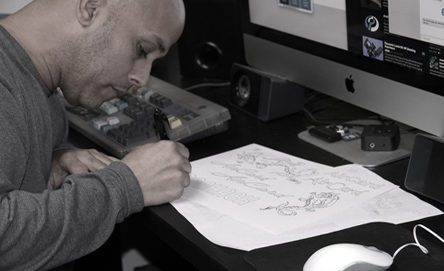
I enjoy using digital tools to execute cutting edge designs but many projects start off using plain ole' pencil and paper and that still works great for me!

stevedesign1bwsm.jpg

Digital design

Nothing beats using the latest software to create stunning designs. I often use a Wacom tablet, 27" iMac, Sketch, Flinto, JustInMind, Marvel POP, and Invision to execute my UI design work. 


Scroll down to see projects I've created while embarking in the UX/UI design methodology study
and as a hired User Experience Designer for a south Florida based company.

UX / UI Design Projects


As a ux/ui designer my goal is to solve a problem or issue a user might experience and to do so with the maximum of benefit to the user while providing a near faultless, invisible experience.

In my research into successful design practices, it has become apparent the most successful designs are those that are as near invisible to the user as possible and provide a high degree of satisfaction, it is those goals I approach design with. Just as a good movie is experienced without thought to the editing, good design should be intuitive and go almost unnoticed; invisible design.

Please continue to scroll down to see some recent projects and their related case studies that provide insight as to the thinking behind the designed user interfaces I created.

 
AirCard New.gif
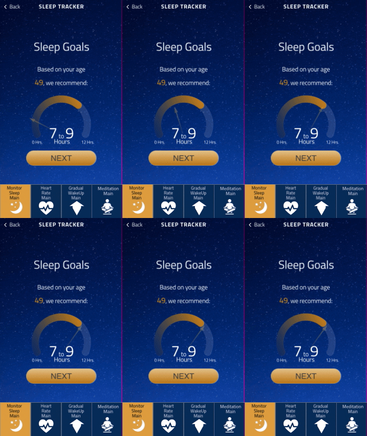
NewSleepTracker.gif
hwacp.jpg
 

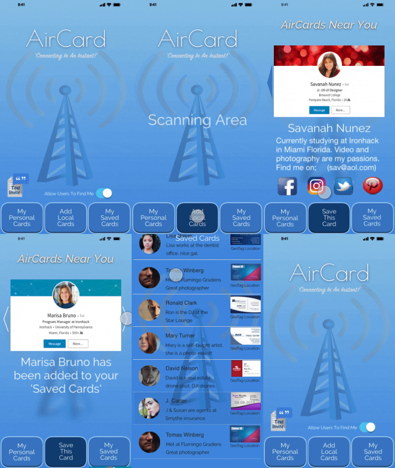
I designed 'AirCard' in response to the unfavorable methods users currently employ in direct person-to-person personal contact info exchange.

'AirCard’ is an innovative prototype app that allows users to transmit/receive cards (contact info) by using a combination of 'Airdrop’ ‘Bluetooth LE’ and ‘Geo-tagging’ hybrid technology very much like iBeacon technology used today.

Trilateration is used to calculate a user's position as well as nearby users and thus allow the transmission of nearby user selected cards the app ‘picks up.’

'AirCard' solves the issue of instant person-to-person contact info exchange and adds the potential for broad adoption of commercial use by allowing businesses to ‘transmit’ information (think coupons/specials) to nearby users thus negating advertising costs. The scalability on this app and it's potential is unmatched today by traditional advertising and represents a potential new era in direct marketing.
'AirCard' has virtually unlimited potential commercial growth as it would allow businesses to transmit ‘cards’ with current specials such as coupons and other information easily accessible by anyone using the app. The user could theoretically move his/her phone around and ‘see’ the information being posted by businesses and personal users alike.

This app has the potential to become a disrupter app in the commercial advertisement space with its iBeacon-like technology and unlimited growth potential.

Designed and developed using Sketch, Flinto & user research.
(See the Ironhack 'Hackshow' presentation below in the playable video.)

 
aircards4.jpg
secure-wifi-img.jpg
aircardgriuop.jpg
barme4.jpg

The "SleepTracker" Project

 
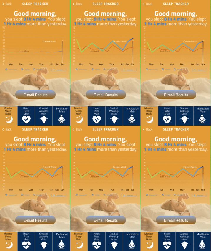
NewSleepTracker2.gif

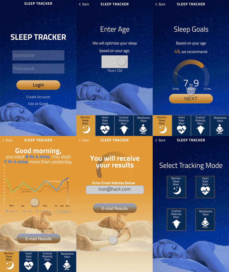
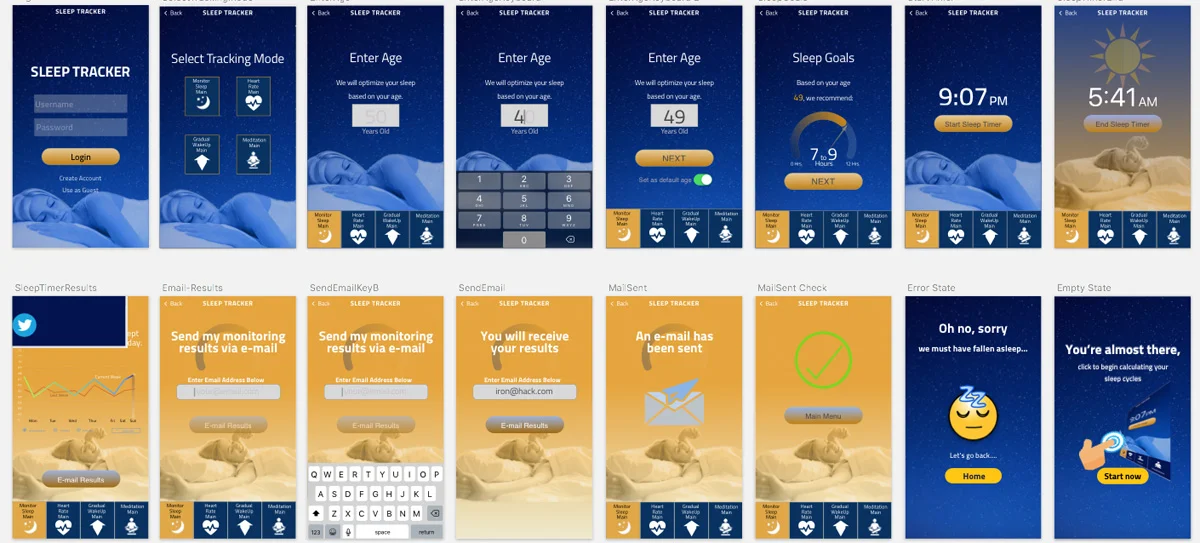
'SleepTracker' was developed in response to The National Wellness Institute's desire to have a suite of 'health' apps created to aid their customers pursuit of improved health.

SleepTracker was developed from low fidelity prototypes to a finished high fidelity prototype using direct feedback from user and desirability testing groups. Prior to feature development, user surveys were created and distributed to over 100 participants which helped form the user persona the app's features would be based on.

An in-depth case study was written on the entire process of development for "SleepTracker" and was published by Prototypr. (See link below)

The Interaction Review - Prototyping Tools

The Interaction Review - Prototyping Tools


NewSleepTracker.gif
ss3.jpg
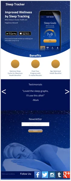
Responsive Landing Page - iOS

Responsive Landing Page - iOS

iphone5-white-preview+uihlicopy+copy.jpg
ss2.jpg
Responsive Landing Page - Desktop

Responsive Landing Page - Desktop

The "ABC Company" Project

 
company-logo.png

The 'ABC Co. Project' was an e-commerce project where I was part of a 3-person team that focused on perfecting one aspect of 'ABC Co.'s mobile online shopping experience. My team was tasked with the optimization of the ordering process and specifically focused on 'list insertion' of which I implemented 'ocr' technology using the phone's camera function. I proposed we use the camera to photograph the 'shopping list' and use optical character recognition (ocr) to populate the shopping cart and proceed to ordering.

We used the full assortment of UX design methodologies for this project which included

  • User Interview Transcripts

  • Survey Results

  • Affinity Diagram Insights

  • Mind Maps

  • Empathy Maps

  • User Journey’s

  • User Stories

  • Storyboards

  • Hand Concept Sketches

  • Concept Testing Results

We were successful in creating prototypes that functioned well and were met with varying degrees of user (task) success. Creating apps that use 'advanced' features using paper-prototypes created some challenges for our tested users. We learned suggesting 'innovative' solutions using low fidelity prototyping created challenges in itself.

Medium fidelity testing revealed this “ocr- list insertion process” was liked by virtually every tester- most agreed they’d like to shop using this technology. While we were happy with our usability test results. our team wanted more time to refine this optimization; the team consisted of Melvin Zantua, Jorge Juan and myself, Steve Nunez.

The full case study is available on Medium via the link in the button below.

 
abc_all_screens.jpg
84aab569-1295-4541-bbc9-238ecf70e013.png
abccompanyMe.jpg
Screen Shot 2017-11-20 at 10.08.26 AM copy.jpg

The "BloomBox Miami" Project
'The Design Sprint Method'

 
bbm.jpg

BloomBox Miami is an online-only flower vendor that prides themselves on their unique customizable floral arrangements made to order. BloomBox had been noticing low site conversions and were looking for solutions to increase sales. My 3-person team sought out to remedy this using the GV Design Sprint Methodology. 

Using the design sprint method our days were as follows;

  • Monday- "Map"

  • Tuesday- "Sketch"

  • Wednesday- "Decide"

  • Thursday- "Prototype"

  • Friday- "Test"

Throughout this process I uncovered a problem in the 'customization' stage at the ordering point and remedied this with a straight-forward solution I redesigned in our revised app.

You can read the details of my devised solution (and the GV Design Sprint processes used) in my in-depth case study published on Medium in the link below.

 
bbm2.jpg
Competitor Analysis Revealed Vast Differences to the Ordering Process- Our Team Streamlined this Process in our Innovative Solution!

Competitor Analysis Revealed Vast Differences to the Ordering Process- Our Team Streamlined this Process in our Innovative Solution!

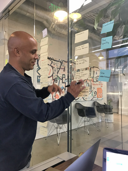
Identifying Frustrations, Pain Points, Goals, Needs, Demographics, of Our Users and Formulating 'How Might We' Statements.

Identifying Frustrations, Pain Points, Goals, Needs, Demographics, of Our Users and Formulating 'How Might We' Statements.

Heat Mapping Revealed the 'Favored' Changes I Suggested To Remedy An Ordering Issue Uncovered with the Current Process.

Heat Mapping Revealed the 'Favored' Changes I Suggested To Remedy An Ordering Issue Uncovered with the Current Process.

Our "User Journey" Storyboard, Happy Ending (Best Case Scenario) Using Our Proposed Ordering Process Solution!

Our "User Journey" Storyboard, Happy Ending (Best Case Scenario) Using Our Proposed Ordering Process Solution!

Presenting Our Solution to the Ordering Process in the Conference Room! (Team L/R ; Andrew Herrero, Juliana Pierdrahita, Steve Nunez)

Presenting Our Solution to the Ordering Process in the Conference Room! (Team L/R ; Andrew Herrero, Juliana Pierdrahita, Steve Nunez)

adfvadv.jpg

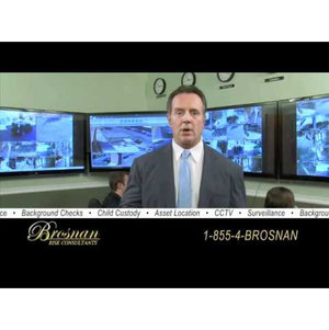
Brosnanrisk

BrosnanRisk is a private security firm founded by highly decorated NYC Police Officer, Pat Brosnan. BrosnanRisk is a full-service Security, Investigative & Intelligence firm with a global network of clients.

Pat Brosnan is a special expert-consultant to NYC's Fox5 TV news network and often responds on-air to various threats and issues affecting New York City and nationwide.

I met Pat Brosnan in New York some years ago and custom painted his motorcycles and trailers. After learning of my digital design capabilities, Pat called upon me to help create digital logos and special branding projects that helped form the BrosnanRisk image he has today.

Brosnanrisk Projects;

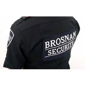
- NYPD BulletProof Vest Embedded Logo Design

- Designed Logos/Graphics for Signs and Banners

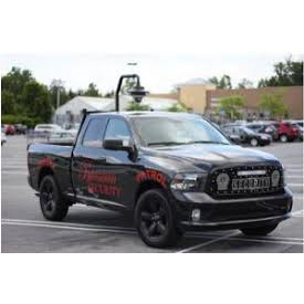
- Designed Vehicle Graphics for Brosnan Patrol Trucks

- Designed App Icons for Future Intra-Securities App

- Provide High Fidelity Photo Mockups of Brosnanrisk Design Projects 

- Mailing Materials and Company Letterhead Logos

- Optimized Graphics and File Formats for External Projects

- Create Graphics for Special Events and Promotions